
Phaedra Solutions
Phaedra’s website had the information users needed, but it was difficult to navigate and easy to drop off from.
I redesigned the experience across web and mobile, restructuring content, simplifying the journey and introducing a design system while balancing SEO requirements while reducing the cognitive load.
The website had valuable information, but many users were dropping off above the fold before reaching it. Content was scattered, the site lacked a clear visual and content system, and key conversion points were easy to miss.
How to restructure a content heavy website so users can quickly understand the offering, find what matters to them and take action — while still meeting SEO and business needs?
Findings through Research
Users didn't need less information. They needed better information hierarchy.
Through heatmaps, testing and conversations with Marketing and Business teams, I identified where users were losing interest and what information mattered to the business.
This helped me rethink the website around a few principles:
Make content scannableUsers should be able to understand a section without reading every word.
Reveal information progressivelySEO content could exist without competing for attention with the main message.
Keep conversion visibleUsers shouldn't have to reach the bottom of a long page to take action.
Five decisions that shaped the redesign
Each one started as a problem in the old experience.
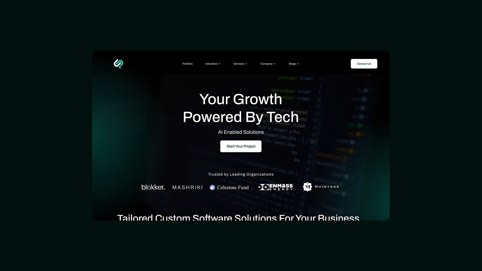
A clearer first impression
The hero carries one proposition and one action. Everything the old page crammed above the fold moved into the sections built to explain it.
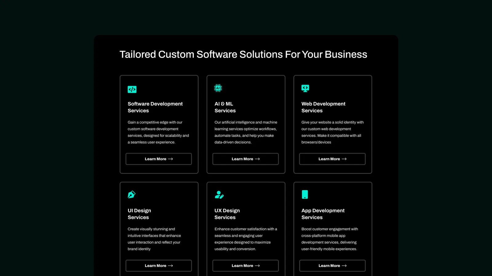
Let users scan before they commit
Services became categories a visitor self-selects from, so relevance is found in one pass instead of read for.
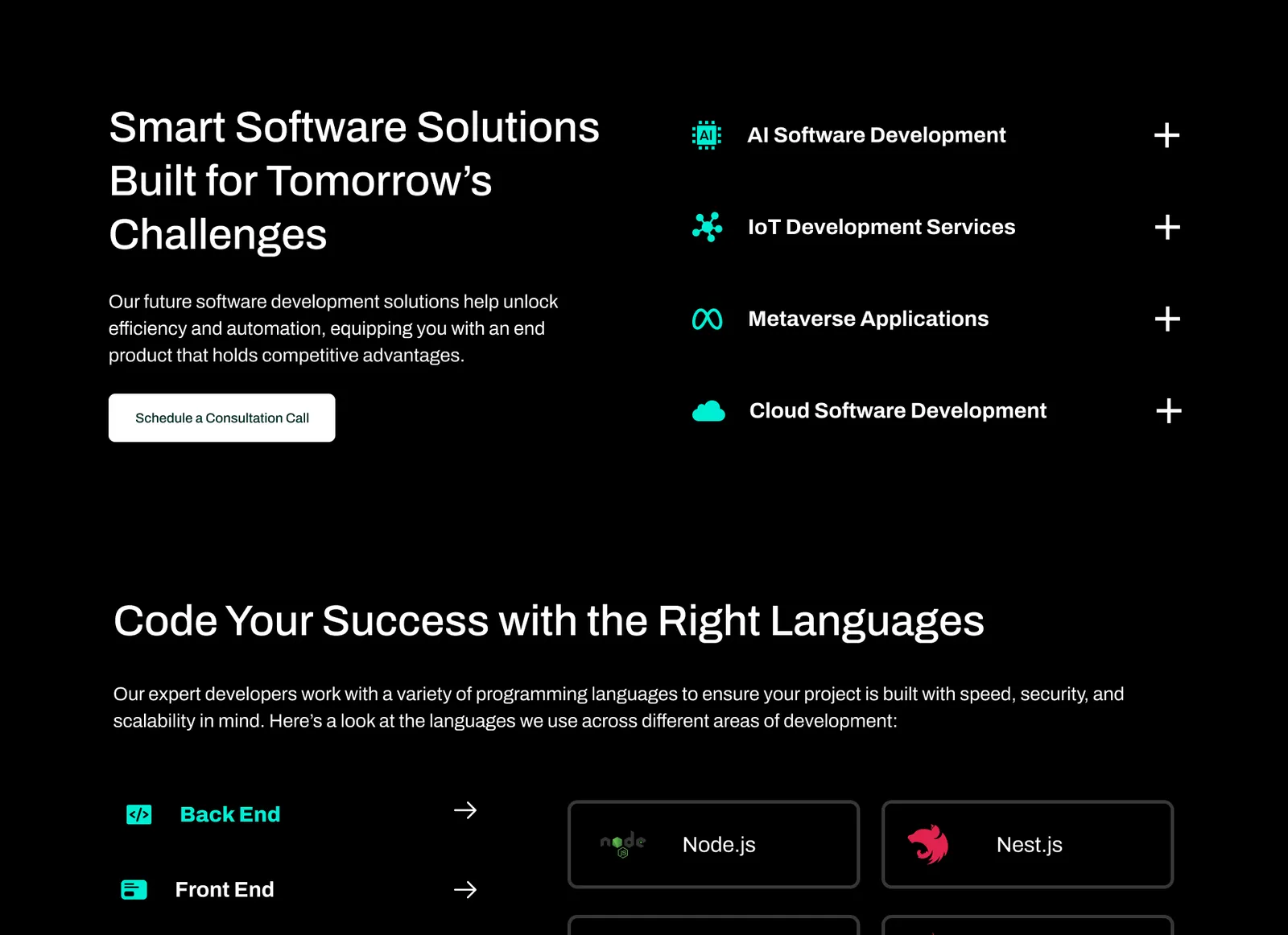
SEO content without overwhelming the user
SEO needed the volume, so I restructured instead of cutting — hierarchy, spacing and modular sections carry the depth.
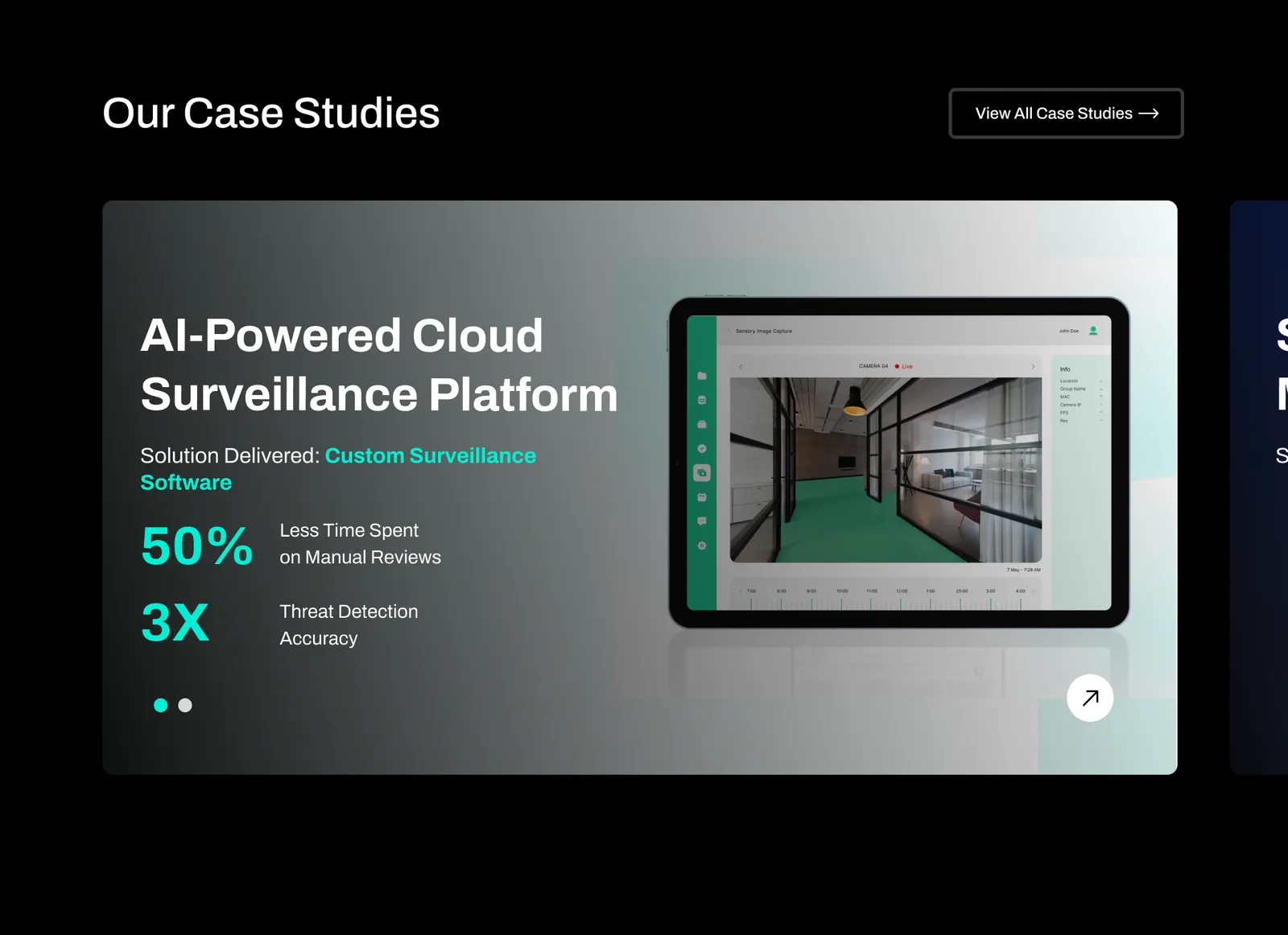
Build trust before asking for action
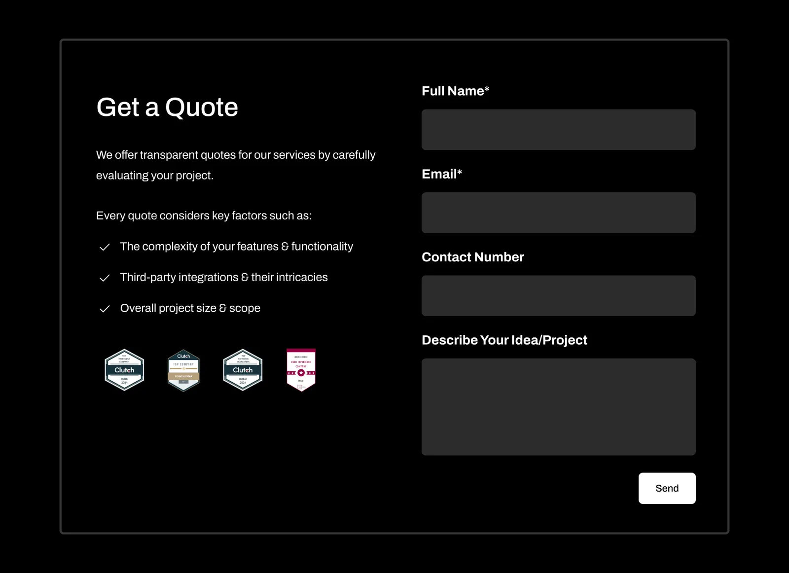
Outcomes and case studies come before the form, so the ask lands after the credibility rather than in place of it.
Built reusable patterns instead of one-off pages
Recurring needs — service blocks, proof modules, CTAs, forms — became components with defined behaviour.
One system behind every page
Type scale, colour, spacing and a component library documented for handoff — so Marketing and engineering could keep shipping pages without me in the room.
The same journey, web and mobile
One hierarchy that holds at every width: the desktop layout expands the mobile reading order rather than replacing it.
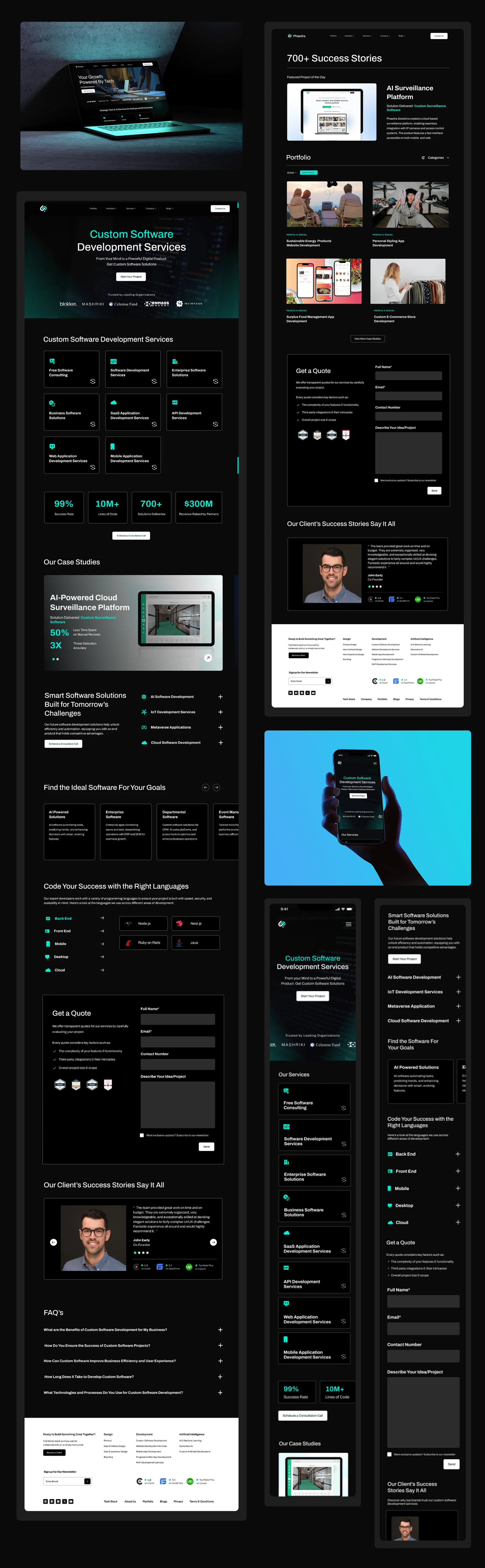


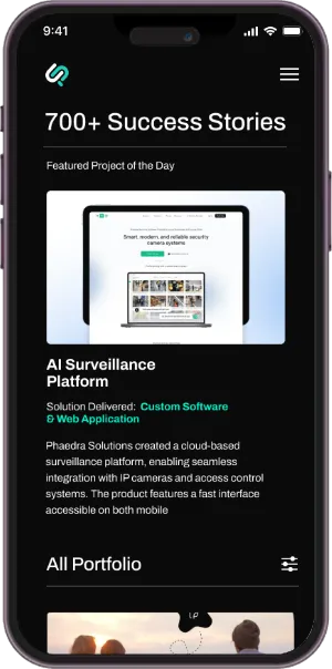
The result was a site that tells the same story at every breakpoint: clear enough to scan in thirty seconds, deep enough for the SEO content the business relies on.
This Project changed how I think about content heavy digital Products
The solution wasn't to simply remove information. It was to understand what users needed first, what they needed next, and how the business could communicate everything else without getting in the way.
It pushed me to think about a website not as a collection of pages, but as a journey from understanding → trust → action.